
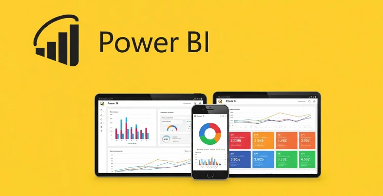
When data meets design, decision-making becomes smarter. Power BI dashboards have transformed the way businesses monitor, analyze, and present key metrics. With intuitive interfaces and real-time data sync, Power BI allows users across domains to visualize what matters most.
From marketing campaigns to financial forecasting, companies are tapping into these dashboards to reveal trends, detect anomalies, and drive efficiency. In fact, according to a 2025 Microsoft Power Platform report, over 70% of Fortune 500 companies rely on Power BI for data analytics and business intelligence.
In this blog, we’re diving into the 15 best Power BI dashboards in 2025. We’ll explore their features, industry relevance, and how they elevate business intelligence to the next level.
What is a Power BI Dashboard?
A Power BI dashboard is a single-page, interactive visualization canvas that aggregates data from multiple sources. It provides a bird’s-eye view of business performance metrics, KPIs, and trends in real-time.
Unlike Power BI reports (which can span multiple pages), dashboards are designed for quick insights and are ideal for executives or stakeholders needing snapshot views. It functions as a centralized decision-support tool since you may pin images from many reports to a single dashboard.
Criteria for Choosing the Best Dashboards
We selected the top dashboards based on the following:
- Clarity of Insights: Easy to interpret and actionable
- Real-Time Updates: Integration with live data sources
- Design Aesthetics: Clean, logical, and user-friendly layout
- Customization Options: Flexibility to adjust filters, KPIs, visuals
- Industry Relevance: Applicability across sectors
List of 15 Best Power BI Dashboards
1. Sales Performance Dashboard
- Industry: Retail & E-commerce
- Created by: Microsoft
- Website: https://powerbi.microsoft.com
The Sales Performance Dashboard by Microsoft offers a comprehensive visualization of sales trends, targets, and KPIs. Built for sales teams and business leaders, it helps users evaluate performance against monthly or quarterly goals. Real-time integration with CRM systems like Dynamics 365 and Salesforce ensures accuracy. Leveraging AI data analytics tools, the dashboard enhances decision-making by uncovering patterns and opportunities within large datasets.
Visual cues like gauges, bar charts, and trend lines make it easy to identify high-performing products or regions. Filters by territory, rep, and product category provide deeper insights. The dashboard is fully interactive, supporting drill-downs and KPI alerts for immediate action.
Key Features:
- Real-time sales performance tracking
- Integration with Dynamics 365, Salesforce
- Drill-down by region, product, or rep
- Interactive charts for revenue trends
- Visual KPIs and forecasting tools
Use Case: Used by sales managers to track regional performance, motivate teams, and identify top-selling products. Helps leadership spot lagging markets and adjust sales strategies on the fly.
2. Executive Insights Dashboard
- Industry: Cross-Industry / Corporate
- Created by: DataBear
- Website: https://www.databear.com
DataBear’s Executive Insights Dashboard delivers high-level business intelligence tailored for C-level executives. It consolidates financial, operational, and HR data into a single screen with clean, high-impact visuals. The dashboard enables users to track profitability, headcount, customer satisfaction, and operational KPIs in real time.
Built-in slicers allow executives to toggle between departments, business units, or timeframes. It’s perfect for board meetings and strategy reviews because of its elegant style and low level of clutter. Seamless integration with Excel, SQL Server, and Dynamics enhances its adaptability.
Key Features:
- Executive-level KPIs across departments
- Simple UI for quick decision-making
- Multi-departmental drill-down capabilities
- Integration with Excel, SQL, and Dynamics
- Real-time data refresh and forecasting
Use Case: Used in boardrooms and by senior management to review business health at a glance and make informed decisions quickly.
3. Financial Analytics Dashboard
- Industry: Finance & Accounting
- Created by: Zebrabi
- Website: https://zebrabi.com
The Financial Analytics Dashboard by ZebraBI transforms Power BI reports and financial data into intuitive, story-driven visuals. It focuses on P&L statements, balance sheets, and cash flow metrics, making complex numbers more digestible. Designed for CFOs and finance teams, it supports IFRS/GAAP compliance and multi-currency operations. Users can perform variance analysis, track budget vs. actual, and identify financial risks. Dynamic charts and waterfall visuals make it easy to convey performance narratives. It’s especially helpful during quarterly reviews and investor meetings.
Key Features:
- P&L, balance sheet, and cash flow tracking
- Waterfall charts for financial storytelling
- Variance and YoY/Month analysis
- IFRS-compliant reporting
- Built-in multi-currency support
Use Case: Used by finance teams for internal reporting, board presentations, and scenario modeling to assess financial health and budget adherence.
4. HR Analytics Dashboard
- Industry: Human Resources
- Created by: P3 Adaptive
- Website: https://p3adaptive.com
This HR Analytics Dashboard provides deep visibility into employee demographics, retention trends, and workforce productivity. It’s tailored for HR departments seeking to optimize hiring, monitor diversity, and reduce attrition. The dashboard visualizes metrics like employee turnover, average tenure, training hours, and open positions across departments. Filters by location, job level, or age help uncover insights about workforce composition. It integrates with Workday, SAP SuccessFactors, and Excel. A predictive layer offers attrition risk modeling for proactive planning.
Key Features:
- Employee turnover and tenure tracking
- Integration with HRIS platforms
- Workforce diversity and gender ratio analysis
- Predictive attrition modeling
- Drill-down by role, department, or geography
Use Case: Used by HR teams to identify talent gaps, reduce churn, and support DEI initiatives with data-driven insights.
5. Customer Satisfaction (CSAT) Dashboard
- Industry: Customer Support / Services
- Created by: PowerBI.Tips
- Website: https://powerbi.tips
PowerBI.Tips’ Customer Satisfaction Dashboard helps service teams monitor customer sentiment, Net Promoter Score (NPS), and ticket resolution quality. The dashboard connects with customer support tools like Zendesk, Freshdesk, and SurveyMonkey to pull real-time feedback data. Visuals include satisfaction heatmaps, top complaints, agent response times, and feedback categories. Filters allow slicing by support channel, region, or product type.
It enables businesses to identify service issues early and track improvement initiatives. Ideal for customer support centers and client-facing departments.
Key Features:
- Real-time NPS and CSAT tracking
- Feedback integration from multiple platforms
- Agent-wise and channel-wise performance
- Issue categorization and trending topics
- Filters by product, location, or sentiment
Use Case: Used by customer service managers to enhance service quality, reduce churn, and identify high-performing support agents.
6. Marketing Campaign Analytics Dashboard
- Industry: Marketing & Advertising
- Created by: Havens Consulting
- Website: https://www.havensconsulting.net
The Marketing Campaign Analytics Dashboard by Havens Consulting is designed to help marketing teams track campaign performance across channels. As one of the most effective marketing analytics tools, it integrates data from Google Ads, Facebook, LinkedIn, and email platforms to offer a unified view of KPIs like impressions, CTR, CPL, and ROI. With timeline visualizations, heatmaps, and budget pacing indicators, the dashboard supports detailed performance reviews. Marketers can segment results by campaign, audience, or region. Its visuals highlight what’s working and where optimization is needed.
Key Features:
- Cross-channel campaign tracking
- ROI and cost per lead metrics
- Audience segmentation filters
- Budget pacing and funnel analysis
- Google Ads, Meta, LinkedIn integrations
Use Case: Used by digital marketers to optimize ad spend, compare campaign ROI, and report marketing performance to stakeholders.
7. Project Management Dashboard
- Industry: IT Services / Engineering
- Created by: SQLBI
- Website: https://www.sqlbi.com
The Project Management Dashboard helps teams oversee multiple projects simultaneously, tracking timelines, resources, risks, and budget adherence. Created by SQLBI, it connects with Microsoft Project, Jira, and Excel to bring project metrics into one platform. Gantt charts, burndown visuals, and risk indicators make it ideal for agile and waterfall methodologies alike. Project managers can assign tasks, monitor deadlines, and highlight bottlenecks visually. The dashboard supports real-time updates and collaboration across teams and stakeholders.
Key Features:
- Visual Gantt charts and timelines
- Resource and task allocation metrics
- Risk and delay indicators
- Agile and waterfall support
- Real-time project status updates
Use Case: Used by PMOs and project leads to streamline execution, manage dependencies, and stay on top of deliverables and risks.
8. Healthcare Performance Dashboard
- Industry: Healthcare
- Created by: Decisive Data
- Website: https://www.decisivedata.net
This dashboard is tailored for hospitals, clinics, and healthcare administrators to monitor operational, clinical, and patient satisfaction metrics. It visualizes data such as bed occupancy, patient wait times, readmission rates, and staff utilization. Built with HIPAA compliance in mind, it can integrate with EHR systems like Epic and Cerner. The dashboard promotes proactive care by showing trends in patient outcomes and highlighting inefficiencies. Filters by department, doctor, or treatment type allow fine-grained insights.
Key Features:
- Bed occupancy and staffing analysis
- Patient satisfaction and care quality KPIs
- Readmission and wait time tracking
- Integration with EHR platforms
- HIPAA-compliant design
Use Case: Used by hospital administrators to improve care delivery, optimize resource usage, and enhance patient experience.
9. Inventory Management Dashboard
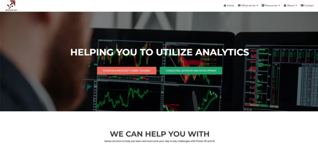
- Industry: Manufacturing & Retail
- Created by: RADACAD
- Website: https://radacad.com
The Inventory Management Dashboard by RADACAD enables supply chain and warehouse teams to manage stock levels, track turnover, and avoid overstocking or stockouts. As a powerful inventory management software solution, it pulls real-time data from ERP systems and inventory tools to present accurate availability by SKU, location, and supplier. Metrics like inventory aging, carrying cost, and order cycle time are visualized in clear formats. Interactive filters let users analyze products by category or sales velocity. Forecasting tools help prepare for seasonal demand.
Key Features:
- Stock level monitoring by SKU/location
- Inventory aging and turnover metrics
- Supplier performance tracking
- Integration with ERP tools
- Demand forecasting visuals
Use Case: Used by supply chain and procurement teams to maintain optimal inventory levels, reduce holding costs, and prevent product shortages.
10. Social Media Performance Dashboard
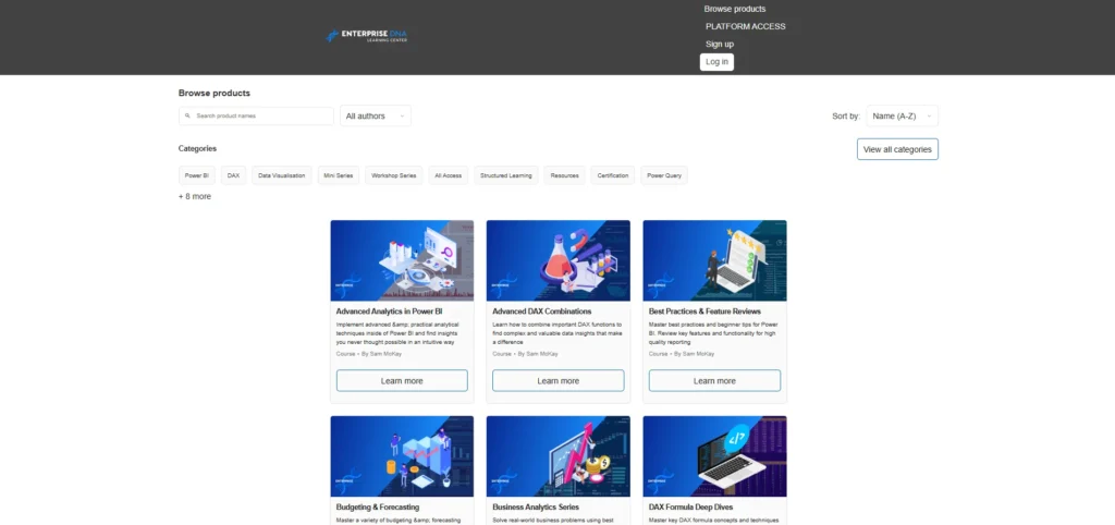
- Industry: Digital Marketing
- Created by: Enterprise DNA
- Website: https://portal.enterprisedna.co
The Social Media Performance Dashboard centralizes analytics from platforms like Instagram, Twitter (X), LinkedIn, and Facebook to give marketers a full view of content performance. It tracks reach, impressions, post frequency, engagement rate, and follower growth. Sentiment analysis and hashtag tracking help evaluate audience response. Interactive visuals enable comparison across platforms, time periods, and content types. It also highlights best-performing posts and ideal posting times based on historical data.
Key Features:
- Cross-platform social metrics tracking
- Follower and engagement trend analysis
- Sentiment and hashtag tracking
- Post frequency optimization
- Integration with API/data connectors
Use Case: Used by social media managers and content strategists to improve audience engagement, schedule content effectively, and analyze campaign outcomes.
11. Executive Financial Overview Dashboard
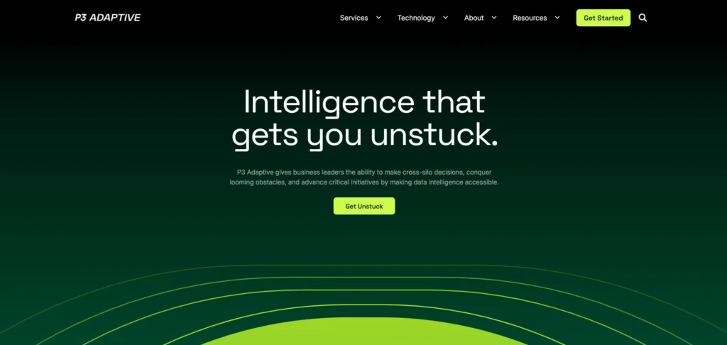
- Industry: Finance / Corporate Management
- Created by: P3 Adaptive
- Website: https://p3adaptive.com
This dashboard offers C-level executives a bird’s-eye view of the company’s financial health. It covers income statements, balance sheets, cash flow, and critical ratios like ROI, ROA, and EBITDA all in one place. Designed for clarity and speed, it aggregates data from accounting systems like QuickBooks, SAP, and Oracle. The clean visual layout makes it easy to identify financial risks, track growth, and compare forecasts vs. actuals. Ideal for boardroom discussions and quarterly reviews, it enables strategic decisions backed by real-time numbers.
Key Features:
- Consolidated income and balance sheet KPIs
- ROI, EBITDA, and profitability ratio tracking
- Actual vs. forecast analysis
- Integration with ERP/accounting tools
- Interactive monthly/yearly breakdowns
Use Case: Used by CEOs and CFOs to monitor business health, report to investors, and make timely high-level financial decisions.
12. E-commerce Sales Performance Dashboard
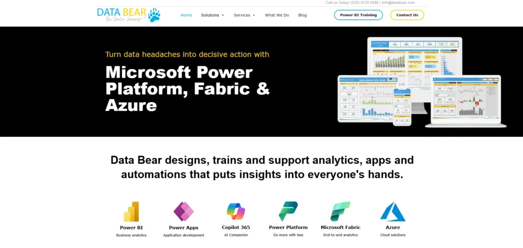
- Industry: Retail & E-commerce
- Created by: Data Bear
- Website: https://www.databear.com
The E-commerce Sales Performance Dashboard helps online retailers visualize revenue trends, cart abandonment rates, top-selling products, and customer lifetime value (CLV). Built to connect seamlessly with platforms like Shopify, WooCommerce, and Magento, it simplifies performance reporting for digital stores. Filters for geography, customer segment, and product categories allow drill-downs to assess channel-wise success. Clear graphs and KPIs make it ideal for daily tracking and monthly strategy reviews.
Key Features:
- Sales and revenue heatmaps
- Cart abandonment and CLV tracking
- Best-performing product analysis
- Regional and channel breakdown
- Integration with major e-commerce platforms
Use Case: Used by online business owners and marketing teams to track sales trends, identify revenue drivers, and improve customer retention strategies.
13. Education Analytics Dashboard
- Industry: Education
- Created by: MAQ Software
- Website: https://maqsoftware.com
This dashboard provides school administrators and educators with real-time insights into student performance, attendance, dropout rates, and curriculum effectiveness. It pulls data from learning management systems (LMS) and student information systems (SIS) to deliver district-wide or classroom-level analytics. With features like gender/equity comparisons, subject-level heatmaps, and teacher performance metrics, it supports data-driven improvement strategies in education. It complies with FERPA standards for data privacy.
Key Features:
- Attendance and academic performance tracking
- Dropout risk indicators and trends
- Subject and teacher-level performance heatmaps
- LMS/SIS data integration
- FERPA-compliant architecture
Use Case: Used by school boards, principals, and policymakers to improve student outcomes, optimize teaching methods, and allocate academic resources effectively.
14. HR Workforce Insights Dashboard
- Industry: Human Resources
- Created by: 4 Impact Group
- Website: https://www.4impactdata.com
The HR Workforce Insights Dashboard centralizes key metrics related to employee headcount, turnover, satisfaction scores, DEI (Diversity, Equity, Inclusion), and training effectiveness. It helps HR teams monitor organizational health and workforce trends over time. Dashboards are customizable by department, region, or employee grade, making it easier to spot talent gaps or morale dips. With integrations to HRIS tools like Workday and SAP SuccessFactors, it supports automation and real-time updates.
Key Features:
- Headcount and attrition trends
- Employee engagement and satisfaction metrics
- DEI analysis and insights
- Integration with major HR systems
- Custom filters by department and region
Use Case: Used by HR managers and leadership to monitor employee trends, support DEI initiatives, and improve hiring and retention strategies.
15. Sustainability & ESG Reporting Dashboard
- Industry: Corporate / Sustainability
- Created by: Avanade
- Website: https://www.avanade.com
This dashboard helps companies track their Environmental, Social, and Governance (ESG) metrics in alignment with global sustainability standards. It includes carbon emissions, water usage, recycling rates, diversity targets, and governance scores. Built with regulatory compliance in mind (GRI, SASB, and CDP), it supports exportable Power BI reports for stakeholders and investors. The intuitive visuals make it easy to communicate progress on sustainability goals internally and externally. Automated alerts notify teams when metrics cross threshold limits.
Key Features:
- Carbon footprint and environmental impact tracking
- DEI and governance reporting
- Alignment with GRI, SASB, CDP standards
- Real-time alerts and threshold warnings
- Exportable board-ready reports
Use Case: Used by CSR teams and sustainability officers to report ESG performance, ensure regulatory compliance, and align company goals with environmental impact reduction.
Conclusion
Power BI dashboards have become essential tools for turning complex data into clear, actionable insights. From tracking sales growth and financial health to monitoring healthcare operations or HR performance, these dashboards help teams stay aligned, responsive, and data-driven. Each dashboard featured in this blog shows how Power BI adapts to specific industry needs with real-time interactivity and powerful visuals.
As businesses scale and data volumes grow, having the right dashboard can mean faster decisions and better outcomes. The key lies in selecting one that not only fits your data but also your goals. These dashboards assist you in painting the complete picture, while Power BI provides the canvas.
FAQs
1. What is a Power BI Dashboard?
A Power BI dashboard is a single-page interactive report showing key metrics through visuals like charts, KPIs, and maps.
2. Can I Customize These Dashboards?
Yes. Power BI dashboards are fully customizable with your data, visuals, filters, and formulas.
3. Are They Free to Use?
Some are free templates; others are premium and may require licensing or purchase.
4. Do They Support Live Data?
Yes. Power BI can connect to live sources like Excel, SQL, Salesforce, Azure, and more.
5. Which Industries Benefit Most?
Industries like Retail, Finance, Education, Healthcare, and HR gain the most from dashboard insights.